Intapp brand guidelines

The Intapp brand

Intelligence is at the core of your firm’s competitive advantage. When your professionals can apply firm and market intelligence, they create impact — a ripple effect of new opportunity.

Our symbol, the Intapp Ripple, is inspired by how our AI technology enables professionals to apply their intelligence and multiply their opportunities for growth.

The full logo is the primary graphic representation of our company and brand. Proper and consistent use of the Intapp logo is critical in all of its applications, from advertising and events to website branding and product promotion.

Full color Intapp logo

Two color Intapp logo

Black Intapp logo

Blue Intapp logo

Dark Blue Intapp logo

Full color negative Intapp logo

2 color negative Intapp logo

White Intapp logo

Intapp logo use

Intapp logo placement

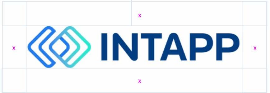
Maintaining proper surrounding clear space ensures that the Intapp logo isn’t crowded by other distracting graphic elements or typography. The minimum acceptable clear space is shown here as represented by “x,” which equals the x-height of the letters in the wordmark. Keep all other text and graphic elements outside of this area.

Intapp logo positioning

The preferred Intapp logo location for digital applications is the upper-left corner of a page or screen. However, if this does not work for your communication, please place the Intapp logo in one of the other corners where it can have as much clear space as possible. In digital applications, it must be seen on first scroll or above the fold. In print, bottom right is the preferred location for the Intapp logo. Positioning should always remain consistent within a given application.

Intapp logo minimum size
Although it can be reproduced in a variety of sizes, do not reduce the primary logo smaller than the minimum width of 1″/72pt/25.4 mm.

Not adhering to these recommendations can compromise the legibility of the logo and negatively affect reproduction quality.

Want more information on using the Intapp logo? Please reach out to press@intapp.com for additional graphics or guidance on Intapp logo use.

Intapp core colors

Our core colors have been expanded to help tell the story of Intelligence Applied.

Intapp Blue is our primary color, with Bright Green as a visual expression of forward movement and the application of intelligence. Dark Blue and Black help with establishing greater contrast to provide more visual impact, as well as stability.

Intapp Blue

PANTONE 2727 C SolidM
C 81, M 49, Y 0, K 0
R 32, G 124, B 236
#207CEC

Bright Green

PANTONE 3255 C
C 72, M 0, Y 37, K 0
R 34, G 236, B 207
#22ECCF

Dark Blue

C 100, M 84, Y 22, K 8
R 0, G 60, B 128
#003C80

Black

C 89, M 77, Y 56, K 72
R 2, G 17, B 35
#021123

Typography

Display typeface

Our display typeface is a sans-serif called Roc Grotesk from Kostić Type Foundry, which is available on Adobe Typekit.

Use for large headlines and subheadlines (H1-H3).

If unavailable or when building a font stack, Libre Franklin can be used as an alternative from Google Fonts, followed by Franklin Gothic as a third alternative.

Roc Grotesk
Intelligence Applied

Recommended weights

Light Regular Medium Bold ExtraBold Black

Typography

Text typeface

Our text typeface is a serif called Financier Text from Klim Type Foundry.

Use for large headlines and subheadlines (H1-H3).

If unavailable or when building a font stack, Martel can be used as an alternative from Google Fonts, followed by Georgia as a third alternative.

Financier text
What Intapp does for you

Recommended weights

RegularBold Black

Typography

Supporting typeface

Our supporting typeface is a modern, open-source sans-serif called Manrope, which is available on Google Fonts. Designed in 2018 by Mikhail Sharanda and modified in 2019 to be a variable font, Manrope is functionally suited to support our product design system while also maintaining similar aesthetic characteristics of Roc Grotesk.

Use for product naming in the symbol lockup and in the UI for the website, such as with buttons, and the product suite.

If unavailable or when building a font stack, Open Sans can be used as an alternative from Google Fonts, followed by Arial/Helvetica as a system alternative.

Manrope
Learn more

Recommended weights

Light Regular Medium Bold